Claude as a Design Studio
I’m not a designer. I’ve used Figma, but mostly for CX flow prototyping in FigJam, not for visual design. I don’t think in grids and spacing tokens. So when it came time to make this blog look like something, I did it the only way I knew how: I opened a chat and started talking through it.
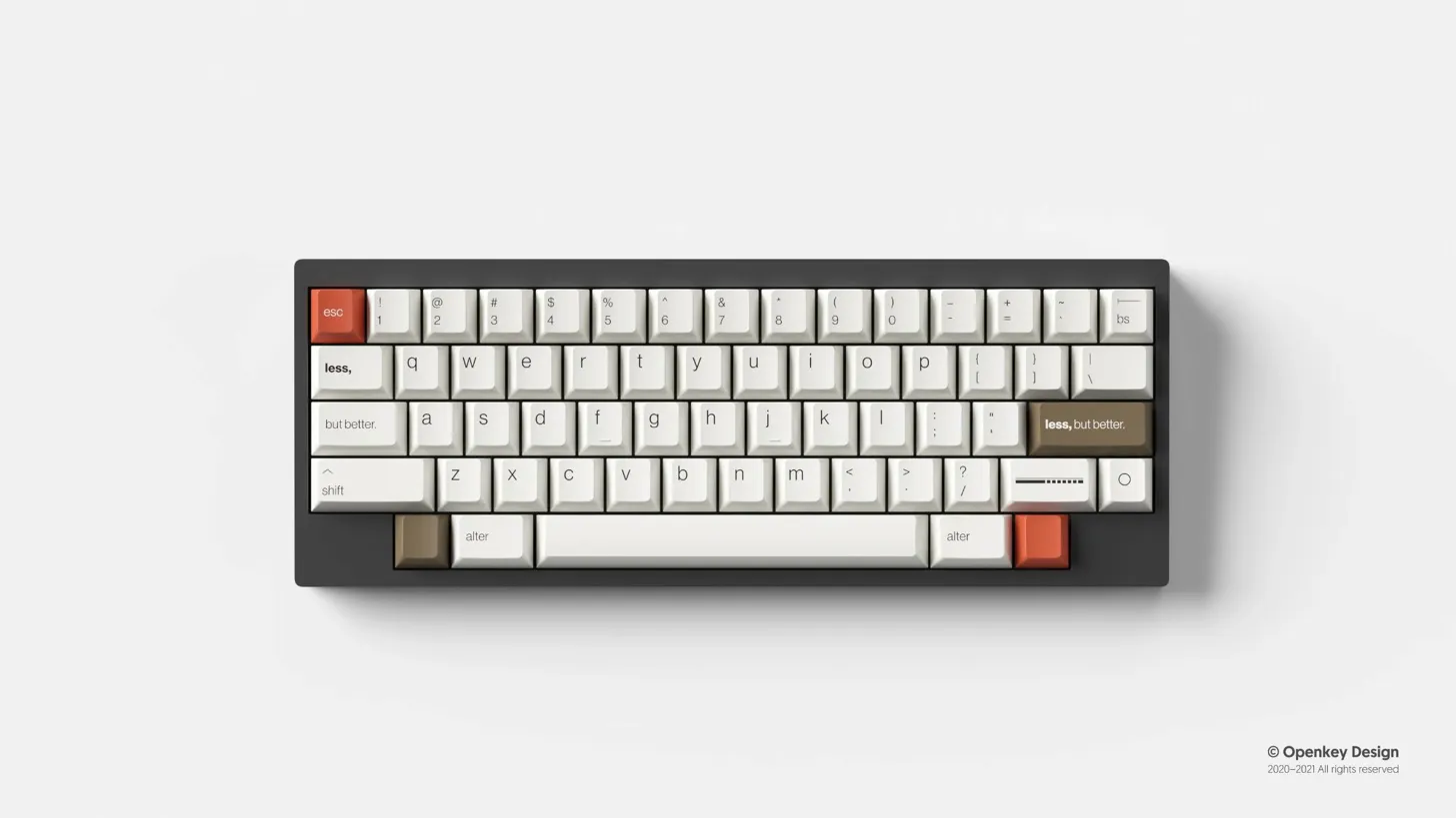
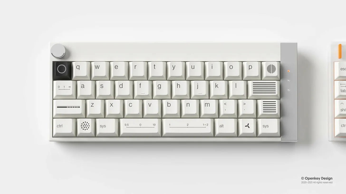
I went in knowing two things. I wanted the aesthetic rooted in Dieter Rams and Braun industrial design. “Less, but better.” Clean geometry, warm surfaces, restraint as a design choice. And I had a set of reference images from Openkey Design, artisan keycaps inspired by that same philosophy. Cream-colored caps, subtle geometric details, that specific Braun warmth.
Those two inputs together turned out to be the whole trick. The design principles gave structure: one accent color, no heavy font weights, hierarchy from size instead of boldness, functional details that earn their place. The reference photos gave something concrete to react to. “More like this, less like that” is a much faster feedback loop than “I want it to feel minimal but warm.”
From there it was iteration. About six rounds on the homepage and post page layouts. Each round I’d see an inline mockup, say what was landing and what wasn’t, and get a revised version seconds later. The accent color landed early (#C44B2F, pulled straight from Braun’s red-orange). Typography took a few passes. The Braun-inspired motifs, speaker grill dots, hatched line dividers, indicator bars, those emerged through conversation as we figured out how to translate physical product details into web design.
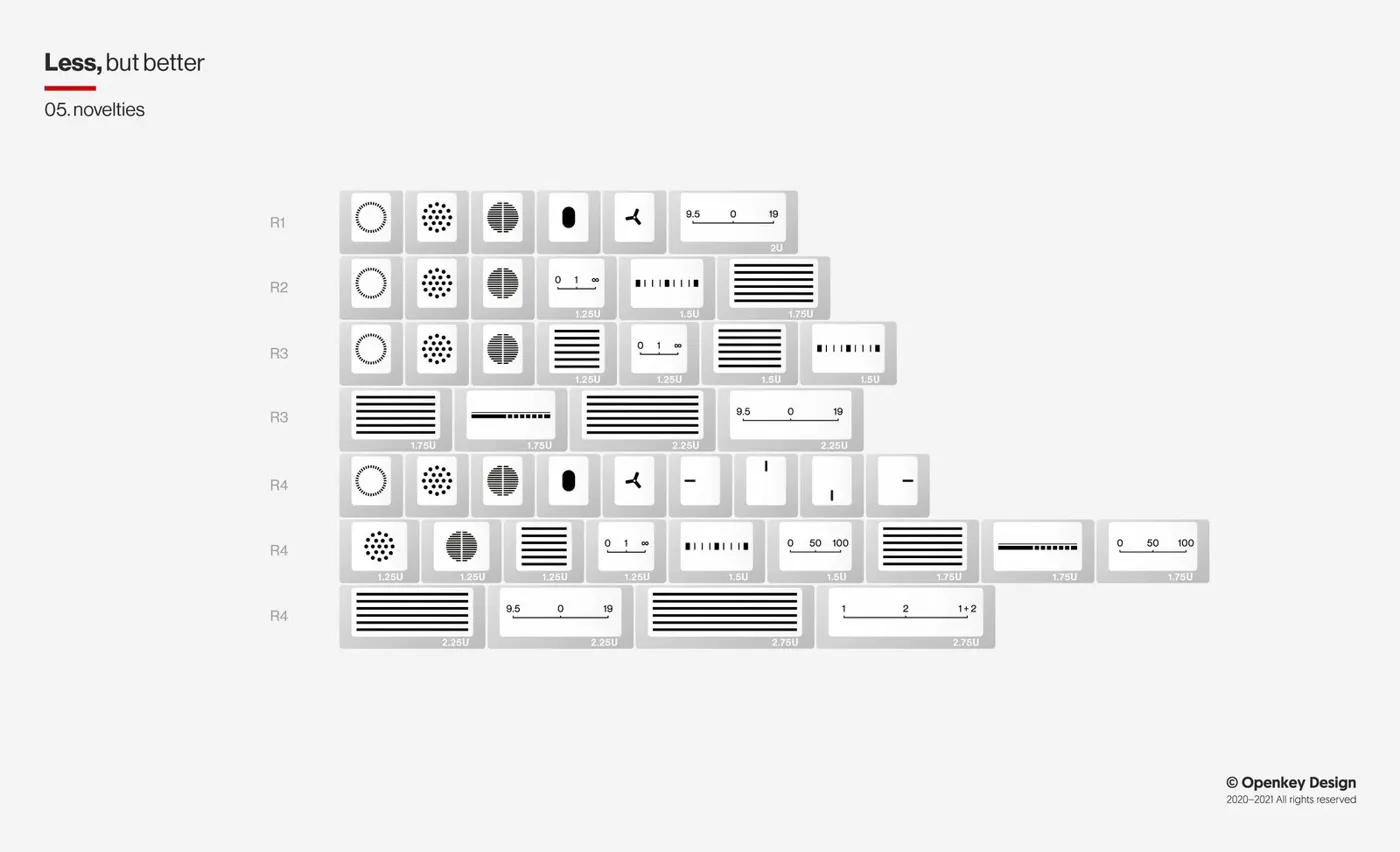
Part of the session produced a set of small icons built from those same Braun motifs: bars, dot grids, dials, menu lines. They came out looking like keycaps themselves, which I loved. I liked them enough that I ended up working a bar motif into the site’s header and footer. That wasn’t the plan going in. I was designing page layouts and ended up with brand elements.
That kept happening. Somewhere in the middle of all this, the scope shifted without me planning it. I’d sat down to pick a look for a blog. But as the visual language came together, I started realizing I wasn’t just theming a website. I was building a brand. And all these gaps I’d been putting off since setting up the Shop became obvious. I didn’t have a GitHub avatar. My Notion workspace had no visual identity. LinkedIn banners, favicons, social preview cards. I’d been deferring all of it because I didn’t have anything to pull from yet.
Now I did. And because the iteration was already flowing, I just kept going. The icon set gave me assets for surfaces I’d been leaving blank since I started. None of it was planned. It all came together at the same time because the pieces were landing fast enough to act on each realization as it happened.
At the end of the session I had enough to hand off to Claude Code: color values, typography, spacing, component patterns, icon exports. Code took it from there and built the real site. I touched on that Chat/Code split in I Am the Orchestration Layer (For Now), but this was the session that made it feel real. Chat for creative direction, Code for implementation, each doing what it’s good at.
It’s not a design system. I still don’t know what I’m doing in that department. But I have a cohesive look across the blog, my GitHub profile, and my Notion workspace, and it all came from one conversation. For someone who has never opened Figma for visual design work, that’s pretty cool.